Academy Awards Project: Best Cinematography
We looked at the visual effects yesterday. Today, we are tackling a similar category, although most of what we see here is done physically. Here, we look at lighting, colour grading, depth of field, framing, and all the goods when it comes to making the perfect shot. This year is interesting, because we actually have three foreign films as nominees (I actually cannot think of there having ever been a time where foreign films dominated an entire category, outside of Best Foreign Language Film, of course). Either way, this might be one of the toughest categories of the year. All of the nominees are absolutely solid, and if it wasn’t for one particular film (do I even need to preface which one at this point?), I wouldn’t even know which would be the best. Nonetheless, this has currently been the hardest list to rank thus far. Here are the nominees for Best Cinematography, ranked from worst to best.
Biggest Snub: If Beale Street Could Talk
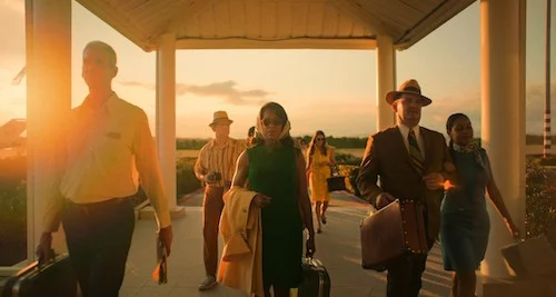
Again, this category is already very tight, but one omission just kept crossing my mind. If If Beale Street Could Talk had a much more successful awards run, it would have been nominated in many other categories (rightfully), including this one. Barry Jenkins has worn his Wong Kar-Wai influence on his sleeves since day one, and most of that is shown through the cinematography. There are extreme close ups. Colour overtakes each shot like a daydream. Slow motion is used tastefully. The lighting is heavenly. This is life being appreciated, and it’s just pure fantasy to witness.
5. Cold War-Lukasz Źal
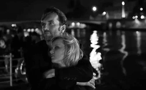
I have never hated putting a film last more than this very moment. The black and white photography is astounding to watch. Light shimmers on every surface. Dust dances through the air, ever so slowly downwards. This is such a textured film. You feel like you can grip every surface. This may have not been listed last on a different day, but alas this is today, and this is how I currently feel. Do not read into this too deeply, because Cold War is incredible visually.
4. A Star is Born-Matthew Libatique
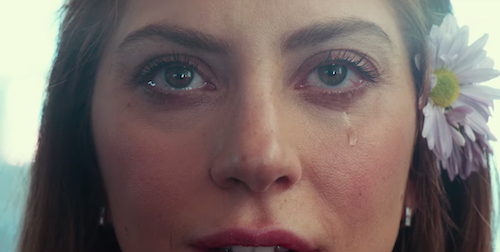
Having a current master like Libatique in fourth also feels very wrong. A Star Is Born is elevated by his use of grainy, filtered imagery. What could have been a very conventional film instead feels confrontational, as if virtually everything has been given a matte finish. This is an instance where the cinematography alone is impressive, but it truly becomes stronger because of its subjects. The passionate story works well with the strong colours, soft focuses, and delicate finishes. I honestly think part of the reason why A Star Is Born sits with you longer than it could have is because of the photography.
3. Never Look Away-Caleb Deschanel
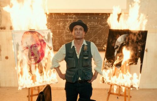
Filmmakers have been trying to make their films look like moving paintings for decades (look at Barry Lyndon: the best film to ever attempt this). Never Look Away is obsessed with pastel colours and natural lighting in its efforts to achieve this effect. It does not try to go all out (unlike most of the nominees in this category, actually), but instead be soft to the touch. Even when light is exploited, you feel more like you are experiencing the brightness of the sources, not the shadows of the foreground. This might be a bit of an understated nominee, because of its fragility. It’s nice to see it here, though.
2. The Favourite-Robbie Ryan
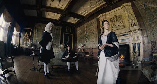
If this was any other year, The Favourite would have maybe even crushed this category. The natural lighting is some of the best this decade (even better than the best ranked film here). The pastel colours here, unlike Never Look Away, are much richer, so the images pop so much more. There are many experiments here, including wide angled lenses, slow motion, and different types of focuses. It’s as if Barry Lyndon and Tom Jones were blended together. This is, again, a living painting, but this time it also feels like a test of the cinematic form, too.
1. Roma-Alfonso Cuarón
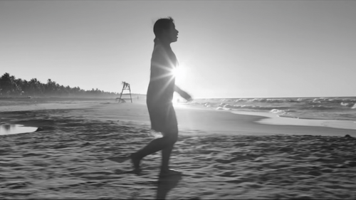
Cuarón has learned many things from his collaborator Emmanuel Lubezki. With Roma, Cuarón shot his own film. From the very first image you see (an extreme close up of water and soap cleansing a dirty driveway), you know you are in for a visual treat. Now that the dust has settled with Roma, I think it is absolutely safe to say that it contains some of the greatest mise-en-scène of the new millennium (maybe even of all time). Every single image has a whole variety of subjects to look at, and all of them are important. One key image that comes to mind is when the family go for ice cream after the bearing of bad news. There is a massive crab structure in the back, whose claws aim at the family below and another group in the back; this latter gathering is a wedding, which contrasts the destruction of a family in the foreground. Not only is the orchestration of all of these images precise, but they are all breathtaking to look at. Super long, glacial pans and takes allow us to ingest all of what we are seeing. It was difficult to rank this category, but it was a no brainer to hand the crown to Roma. Oscars or no Oscars, Roma flat out has the best cinematography of the year.
Our Predicted Winner: This will likely go to Roma, but things can change in the next couple of weeks.
Our Academy Awards Project is an ongoing series that will continue until all the categories have been ranked and reviewed. Tune in Monday to Saturday for a new category each day.
Andreas Babiolakis has a Masters degree in Film and Photography Preservation and Collections management from Ryerson University, as well as a Bachelors degree in Cinema Studies from York University. His favourite times of year are the Criterion Collection flash sales and the annual Toronto International Film Festival.


