The Art of Making New Films Look Older
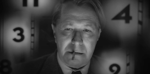
Mank
David Fincher’s upcoming Mank is one of many films to purpousefully represent a different — usually older — cinematic era. Considering it is based on the creation of Citizen Kane, Fincher’s latest feature intentionally looks as shadowy and grainy as the iconic Orson Welles debut (as well as many other attributes, including dated effects). Even the stills of the film alone evoke exactly the nostalgic sensation that Fincher was going for. It’s astonishing, really. Again, this isn’t the first time that a filmmaker has tried to achieve an older aesthetic (far from it), but it’s always fascinating when pulled off. So, how exactly do filmmakers pull this off? Is it actually a perfect illusion?
Let’s tackle the how first. As already discussed with Mank, filmmakers can start with the obvious use of how a feature looks to begin this trickery. A film can be digitally altered to appear older, or it can simply be filmed via older means (either being shot on film instead of digital, or directors like Robert Eggers can go the extra mile and actually use older equipment to authentically capture the shooting styles of yesteryear). Already, there is something with this aspect of shooting “older” that I catch right away, and it’s because I have seen far too many films. Usually, the illusion is almost there but not completely foolproof, because of the techniques in which this “older” aesthetic is used. I’m talking about movement (panning, the use of a dolly, and zooming). If the actual breath of each shot feels modern (it usually will, given the second nature of whomever will literally be shooting a scene), then the entire shot will feel like a modern tribute, rather than the deceptive time capsule that filmmakers are seeking.
A good example of a film abiding by this — since he is ever so the perfectionist in this way — is Eggers’ The Lighthouse, which fixes on static shots and very simple pans. Of course, this film is a bit too pristine looking, but it’s very close to feeling authentically like a ‘30s horror film (sans the extreme violence and sexual nature, of course).
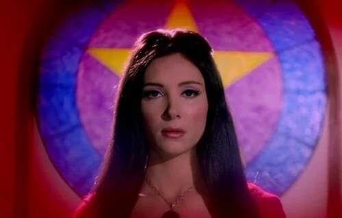
The Love Witch
Other visual components that matter are the kinds of elements that pertain to any film that tries to evoke a sense of the past, even if the aesthetic of said film is modern itself. Like any other period piece, costumes, makeup, sets, and other important components are used. I’m more interested in the creative side of things, especially since it is so evidently difficult to try and make a film seem older than it really is (as we saw with the cinematography of a film alone). Audio design is no different, and there are some telltale signs of manipulation despite a designer’s best attempts. Usually, the older you go with sound, the muddier or tinnier it is, considering the limited recording devices and technologies. So, a sound designer will try and recreate this with digital manipulation (they could always go the distance with using archaic equipment, of course).
A keen ear can still pick up these manipulations, though, mainly because modern sound is still far more advanced, even at a fundamental level. Forget the multiple recording tracks used to represent one muddy track crackling. Considering how each era recorded sound, you’re just going to get different results altogether, unless studios are willing to experience delays caused by recording everything live (if aiming for the ‘30s and ‘40s), or have many takes that are less dynamically edited together from separate, smaller parts (‘60s to about the ‘80s). Anything newer is easier to pull off, since there isn’t too much distancing between how these processes are done (outside of the refinement of technology, and the major shift from analog to mostly or strictly digital). Trying to achieve older sound recording tropes is incredibly difficult if you’re not using the actual equipment used back then.
The Lighthouse
Having said all of this, some films have pulled off this illusion insanely well. The television footage in Forrest Gump still looks rather remarkable, even if it’s obvious as to how the effect is done now; even ten years ago, Forrest Gump was looking fantastic. There’s also the movie-within-a-movie in Home Alone that has fooled people for decades. In these instances, the illusion is shown briefly, so you’re not staring in the face of the magic trick for too long, as to notice the discrepancies. While there are features that are noteworthy for seeming older (The Love Witch, Begotten, amongst many others), I’m not sure if the illusion will be exact unless films are shot literally how they were once shot. Then again, I am pretty sure these very minor signs aren’t blatant to the common viewer, and I’m only proving that I watch too many films and perhaps need to get a life. At the end of the day, the attempts are amazing alone, and being able to tell slight differences is barely a problem that takes away from the remarkable work to even get to these places.
Andreas Babiolakis has a Masters degree in Film and Photography Preservation and Collections Management from Ryerson University, as well as a Bachelors degree in Cinema Studies from York University. His favourite times of year are the Criterion Collection flash sales and the annual Toronto International Film Festival.


