Best Production Design: Ranking Every Oscar Nominee
Written by Andreas Babiolakis
Last year’s winner: Once Upon a Time… In Hollywood.
I’ve ranked how characters dress themselves in the Costume Design category, and how they touch themselves up in the Makeup and Hairstyling group. Now, let’s take a look at the final piece of story building on set: the Production Design section (I’ll be doing Visual Effects next week, since it’s a post production method). What living areas, communal places, or settings were the best made? How intricate were these designs? As usual in one of these kinds of categories, we have some strong nominees, but arguably one of the more glaring snubs of this year’s Academy Awards (more of that in a second). Here are your nominees.
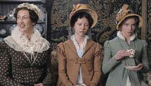
Biggest Snub: Emma.
Emma. not being here is ridiculous. The film was on the Academy’s radar, since it got noms in other on-set related categories, so I’m not sure how it was missed here. Everything else about Emma. is nice, but its literal greatest strength is its production design. The close ups, wide shots, and other forms of photographical appreciation of these sets is enough evidence of this! The wallpaper is an endless labyrinth to look through. The props are all so fascinating. These were easily the best dressed settings of any film I saw last year (outside of my number one pick, that is), and its absence here is actually astonishing. How??
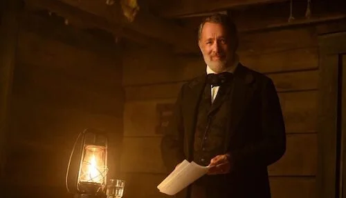
5. News of the World
Production Design: Peter Francis
Set Decoration: Cathy Featherstone
News of the World is put together really well, but it has its exterior scenes working against it. Enough of the film takes place outside, in wastelands or plains, and there is only so much production-based evidence for the film to be acknowledged for this category, but not to win it. Still, the odd time you’re indoors, News of the World is extremely convincing (and beautifully made to boot). I don’t know if it will be able to compete, though.
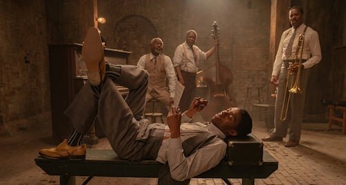
4. Ma Rainey’s Black Bottom
Production Design: Mark Ricker
Set Decoration: Karen O’Hara & Diana Stoughton
In a similar way to News of the World, Ma Rainey’s Black Bottom has narrative limitations working against it (even though it is one of the higher projected possible favourites to win in second place). It mostly takes place in one setting, but my what a setting that is, with realistically aged wallpaper and flooring, glorious furniture, and the recording studio set up that feels so authentic, that you could swear you were just in a time machine. If Ma Rainey’s Black Bottom wasn’t confined to one place for most of the film, I could swear it might even win this thing.
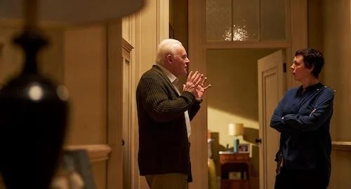
3. The Father
Production Design: Peter Francis
Set Decoration: Cathy Featherstone
I’d argue The Father is less well put-together than Ma Rainey’s Black Bottom fundamentally, but it gets the extra love because of the complexities of its sets that play into its metaphysical nature. Without spoiling for those who haven’t seen the film, setting is a huge part of the film’s ethos, as it quite literally shifts at times (and not via virtual effects, so these are all practical creations). Even without these benefits, The Father just feels like it is pieced together so interestingly; these are just the objects and stomping grounds of someone with enough of a fortune, but they still feel like they’re actually belongings and not just props.
2. Tenet
Production Design: Nathan Crawley
Set Decoration: Kathy Lucas
Of course Tenet is a large scale film, because it’s a Christopher Nolan production, who places emphasis on practical effects and backdrops. So, naturally, the scope of these Tenet sets is massive! Not only that, but you have sets that work fairly uniquely, given the whole gimmick of the film (the toying of time as a linear construct, and the possibility of living in reverse). The CGI used are finishing touches, but so much of what Tenet pulls off is all on-set magic. Even when it’s not being a mind bender, Tenet is gorgeously made as a production.
1. Mank
Production Design: Donald Graham Burt
Set Decoration: Jon Pascale
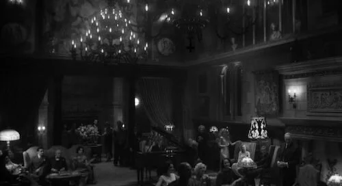
Finally, I have Mank first for something (out of all of the nominations I’ve gone through so far)! There is so much work put into making Mank feel like it is genuinely from the Golden Age of Hollywood, but it’s its production design that really sells it for me. The Hollywood sets are such a feast to experience. The dining halls and living rooms of the elite are endlessly designed. They even have the mansion that inspired Kane’s Xanadu, for crying out loud! For me, Mank is head and shoulders above the rest of the nominees this year. The sets are a primary reason why I find the film such a fantastic world to be sucked into (another major reason will be discussed next week, mind you; no spoilers on what category it will be, but it’s quite easy to guess).
Who I want to win: Give me Mank in this category any day. I think it’s brilliantly designed.
Who I think will win: Currently, this looks like Mank’s trophy to win, and it’s not just me saying that.
Tune in tomorrow for our next Academy Award category! We’re reviewing every single nominee.
Andreas Babiolakis has a Masters degree in Film and Photography Preservation and Collections Management from Ryerson University, as well as a Bachelors degree in Cinema Studies from York University. His favourite times of year are the Criterion Collection flash sales and the annual Toronto International Film Festival.


