Best Cinematography: Ranking Every 96th Academy Award Nominee
Written by Andreas Babiolakis
This article is a part of the Academy Awards Project, where Andreas Babiolakis from Films Fatale ranks every Oscar nominee from worst to best, and goes through every category once a day five days a week.
I may be saying this a lot as I go through each and every Academy Awards category this year, but we have reached a stacked group of nominees. Best Cinematography is full of strong contenders, and I still think that there are some brilliantly shot films that didn’t make the cut. What makes a film well shot? To me, visual composition is important (mise-en-scène, focal points, rule of thirds, et cetera). The use of static versus moving (dolly, crane, pans) shots and when they get utilized is also crucial, since it’s important that the right tones and moods are set precisely when needed. Lighting is a must, and I’ll observe the uses of natural and/or artificial lighting alongside how darkness and shadows are implemented. Lastly, let’s not forget about the use of colour and/or greyscale! I’ll also have to get critical this time around because of how tight the competition is, so I’ll be docking points for the reliance of the same techniques versus films that have an endless pool of photographical creativity. Which of the five nominees look great? Well, all of them. Again, this is quite the category (I’d argue it’s one of the strongest of them all, this year). Which film is the best shot? Well, let’s get to that shortly.
Here are your nominees for Best Cinematography ranked from worst to best.
Biggest Snub: Saltburn—Linus Sandgren
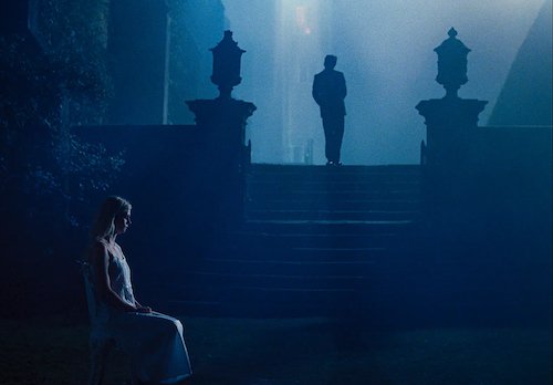
God. So many stunning films to choose from. I didn’t want to bring up The Zone of Interest a billionth time, even though I found it the most visually striking film of the year, and I could have used this opportunity to discuss Past Lives, The Holdovers, or All of Us Strangers. Instead, I’ll bring up the film that I thought would squeak in one or two nominations (when it got zero): Saltburn. This candy-coloured, gothic paradox is a feast for the eyes that uses reflections, obstructions, fogginess, depths-of-field, and so many other treats to its advantage. Not a single shot of this film looks off. I know there are roughly twenty films that could have made it because last year fostered many well-shot films, but Saltburn not getting in here was possibly one of the biggest surprises (especially since the film has such a following that there were talks about it getting a Best Picture nomination not even that long ago); I thought maybe all of its award season promotional eggs would be placed in one basket for this category, but that was not the case.
5. Killers of the Flower Moon-Rodrigo Prieto
Oh, I don’t like placing this one last, but here we are. I dig the sepia tones and use of natural lighting, creating an old-timey photographical, amber aesthetic. The strength of Killers of the Flower Moon comes from the dynamic angles (which give editor Thelma Schoonmaker a field day on shot selections to use for cross-cutting), and the movement (or lack thereof) of the camera. There’s a lush, fluid visual style to this film that I really like. It’s just that I have to split hairs here whilst ranking five films that even deserve to win, so I’ll do so here: Killers of the Flower Moon is the least showy of the nominees. That’s it. No shortcomings otherwise.
4. Poor Things-Robbie Ryan
Now I absolutely love how Poor Things looks. It is a watercolour, lush-yet-metallic, sci-fi-fantasy spectacle full of breathtaking shot after breathtaking shot. I cannot emphasize how much I love the photography in this film. Having said that, again, the competition is fierce this year, and I’ll have to get a little nitpicky. Do I love how fisheye lenses are used here? Absolutely, even though other filmmakers may not use them nearly as strongly or wisely. Do I think they’re overused in Poor Things? No. Not at all. In relation to this ranking, would I prefer a film that has more of a variety going on rather than a film that focuses on the same few tricks — albeit ones that work tremendously well — for most of its duration? Sure. I also think that The Favourite is a little more thought-provoking with its use of wide-angle lenses and the like (it also is stronger due to its heavy usage of natural lighting), but Poor Things is still a visual smorgasbord, so don’t get this lowish rank twisted.
3. Maestro-Matthew Libatique
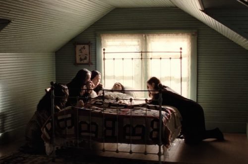
I’m a huge fan of Matthew Libatique and part of the reason why is how he occasionally shoots in the way that an editor splices cuts together: to be as deceptively simple as possible. There are times that I forget how strong his cinematography is because of how naturally he causes your eye to drift to the focal points he wants you to see, but if you take a second to look around, there are many subtle visual cues happening. Furthermore, Libatique shines exactly when he chooses to, and it’s at these moments — full of washes of natural lighting, the pulp of filmic grain, or details in an object or a person’s weathered face — that you are reminded of how strong his eye for photographical arrangements is. His balance is key, and I think that counts for something in a film like Maestro where all of the above qualifications apply; it may actually be one of his best shot films to date, which says a lot.
2. Oppenheimer-Voyte van Hoytema
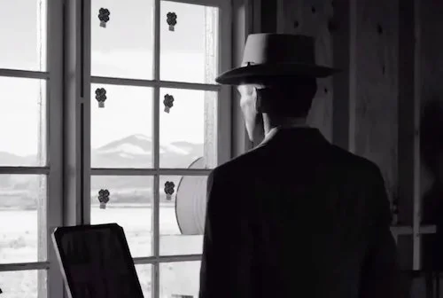
Believe it or not, three nominees this year implemented both colour and greyscale cinematography (including Poor Things to separate the life of Bella Baxter’s development from the times where she becomes her own individualistic spirit via awakening, and Maestro to section off the different years of Leonard Bernstein’s life). The third is debatably the best implementation of them all, via Hoyte van Hoytema’s separation of two thematic trains of thought in Oppenheimer. Whether it’s fission/subjectivity/colour looking washed out, like a series of memories, and gorgeous, or it’s fusion/objectivity/black-and-white looking pronounced, calculated, and more upfront (while still striking), Oppenheimer is quite possibly Christopher Nolan’s best-looking feature to date, and Hoytema’s masterful work here will most likely lead to the director of photography finally getting that Oscar he’s deserved for a while.
1. El Conde-Edward Lachman
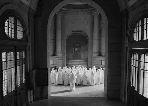
I don’t mean to be otherwise or act like a contrarian, but I need to stick to my guns at all times. El Conde was one of the last Oscar nominees I watched this season because of this surprise nomination (it was always a part of the discussion, and Edward Lachman is obviously a seasoned veteran of the industry, but I just didn’t think it would pull it off). I was gobsmacked by how strong the photography here is, as if Lachman is evoking the films of Béla Tarr. El Conde is obsidian, dismal, grotesque, shadowy, and full of piercing whites and lights when needed. A major reason why El Conde is a worthwhile watch for its entire duration is because of the consistency of the overwhelmingly beautiful cinematography present throughout (rescuing the film from its occasional lopsidedness found elsewhere). I love the contradictions here where the photography is sensational, but what we are seeing is abnormal or even abominable. Again, I don’t want to go against the grain just for the sake of it. Out of these five nominees, I think El Conde is the best shot film, even if it wins by mere molecules ahead of Oppenheimer.
Who I Want To Win: I’d say all nominees, but the top three nominees are legends of the craft, so I’ll be rooting for Oppenheimer’s Hoyte van Hoytema, Maestro’s Matthew Libatique, and El Conde’s Edward Lachman.
Who I Think Will Win: Despite the high calibre of these nominees, I think the clear winner at this point is — of course — Oppenheimer’s Hoyte van Hoytema. The only other possible winner I can see is Rodrigo Prieto with Killers of the Flower Moon, who, like the three names mentioned above, is also an Oscar veteran who has never won. I usually try to reinstate that most Best Picture nominees pick up at least one award, and Killers of the Flower Moon may have its sole win here (or for production or costume design). Again, I think this is set for Oppenheimer to win at this rate, but don’t be surprised by another name being called March 10th (this category is stacked, which may dilute how many votes the winning film will get).
The Academy Awards Project will continue tomorrow with another category. We’re going to rank every single nominee in every single category, Monday through Friday. You don’t want to miss it!
Andreas Babiolakis has a Masters degree in Film and Photography Preservation and Collections Management from Ryerson University, as well as a Bachelors degree in Cinema Studies from York University. His favourite times of year are the Criterion Collection flash sales and the annual Toronto International Film Festival.


