Distance Learning Film: Rule of Thirds
If you aren’t familiar with the rule of thirds when it comes to photography (or, in this case, film), then you may be opened up to a whole new world of analyzing visual media. This notion was invented by artist John Thomas Smith in 1797, in relation to paintings. He, in turn, was trying to keep up with a visual lesson by painter Sir Joshua Reynolds, who was advising artists to create imbalances using perceived brightnesses and focal points in an image that can be divisible into, well, thirds. Lo and behold, here we are today, where mobile phone applications now come with grids, and this idea is taught in every school.
In short, the rule of thirds, also known as the nine zone grid, is two sets of two lines: two horizontal, and two vertical. This creates the perception of nine equally sized rectangles, that dissect your shot. The goal is to have your focal points interact with these lines, rather than just be placed smack dab in the middle of a shot. Ideally, focal points should hit the parts where the lines intersect: there are four of these points on the grid. However, this is a visual medium, and seeing will make this lesson make more sense.

Found on Kafkas Friend.
In this shot from 2001: A Space Odyssey, you can see the two subjects holding a conversation are right on the upper intersecting points. This is also an extreme example, because Stanley Kubrick himself was a photographer before he was a filmmaker, so you’re going to get a little bit more out of this image. Way in the back of the shot, in the middle rectangle, is the window to the HAL 9000, who is peering in on the conversation. However, HAL is not the focal point. Its presence is meant to linger on in the background, merely being a passive threat to what is going on in the foreground. Consider the conversation to be what you’re meant to focus on, and HAL 9000 an extra bonus for your eyes lingering around the picture.
That’s precisely why the rule of thirds works. Having a focal point placed right in the middle of a shot will make you painfully aware of what you should be looking at, but it limits you from what you can be looking at. With focal points on either side of the shot, preferably in the intersecting lines (so they’re not too far over, and causing too much empty space), you are almost granted permission to let your eye wander around. A focal point doesn’t have to be the only point, and visual artists know this. Here’s a brief lesson on implementing this rule for beginners, courtesy of Learn Online Video.
The Rule of Thirds: Basic Example
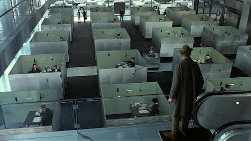
One of cinema’s greatest visual comedies ever is Jacques Tati’s Playtime, mainly because it is a visual feast. Often considered one of film’s best shot works ever, this silly series of cinematic gags is not just clever: it’s beautifully captured. This encourages viewers to look around as many places on screen as possible, to try and find more jokes that they may have missed.
This is considerably a basic scene in the film when it comes to visual composition. Notice how at almost all times, one of the two chairs (or both chairs) in the meeting room hits either an intersection point, or at least falls on either of the vertical lines. Even the pictures in the background usually lands on either of these sections as well.
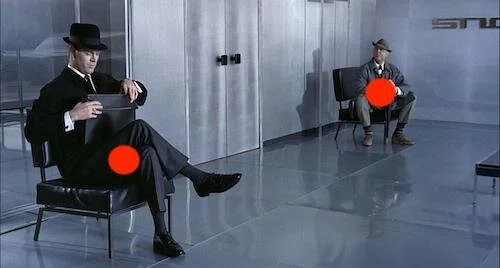
The red circles are loosely around where two of the intersecting points would be, but I refrain from using a grid, because a grid can be limiting if you’re hellbent on only hitting exact certain spots. Understanding the rule of thirds as a general principle is enough. In this above shot from Playtime, the focus is on creating a pleasing perspective as well: with the person further back reaching the top right intersection, and the person closer hitting the bottom left intersection, we have a stunning gaze of depth, as well as the focal points being where they need to be.
Here’s another clip from the same film. Notice how the punchlines usually end up on the intersecting lines, or break the rules and use the centre of the shot.
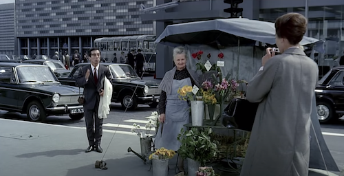
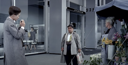
Coincidentially enough, this scene is playing with the idea of photography. An American tourist is trying to take a photograph of a Parisian elder at work, but city folk keep getting in her way. The first round of mishaps happen with the photographer on the right top intersection, and a series of pedestrians on the top left. The worker is in the middle, so we ignore her for the most part. The tourist having a hard time with the pedestrians is what sticks out to us.
Shortly after, the biggest laugh comes in the form of the rule being intentionally broken. The next shot is with the photographer on the left side, and the worker on the right. Finally, the worker is a focal point, and the photographer remains in a prominent spot as well. Suddenly comes in one more pedestrian — the most awkward of them all — who lingers in the middle of the shot. It creates a discomfort, because the visually pleasing set up has been disturbed. You don’t absolutely have to always shoot with a nine zone grid, but this is exactly what it looks like when using the grid goes wrong. It’s a moment saved for the last disruption, as a means of being the punchline after a series of already comedic disturbances. Notice below how both focal points have now been pushed aside (too far past their lines of intersection) to accommodate the citizen in the middle who simply won’t leave?
Of course, there’s also the male American tourist that now wants to take his own photograph: Notice how he pushes the female tourist into the opposing side’s intersections, and how the rule is still used?
Before we move on to a couple of alterations to the rule of thirds, here are a number of films that contain amazing examples of this rule-of-thumb: grid free, as intended.
Barry Lyndon
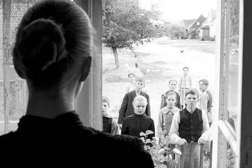
The White Ribbon
Persona
The Rule of Thirds: Advanced Examples
You’re going to find films that use the same guidelines and tweak them a little bit. This usually causes a bit of unrest, as well as a sense of calm (that utilizing the principles fulfil). In this long shot from Sátántangó, notice how the two subjects are in the middle, yet their heads hover above the upper horizontal line, so they’re not quite centred. The buildings beside them aren’t really in the intersections of the grid, so they’re not the focal point either. Instead, this shot places the empty space — the flying litter — as the focus, so you may feel intrigued but you never feel completely satisfied. This is intentional, given the film’s purposefully challenging nature.
Then you have another rule-breaker that feels much more satisfactory: The Tree of Life. In this opening sequence below, you’ll see the grid being used and then broken in almost a pattern-like fashion. A subject will fall on the intersecting lines, and then the next shot will have the focus right in the middle of the shot: either that, or the camera will pan to make the subject (or a new subject) centred. This may not make one feel uncomfortable, but instead mimics the wandering eye that this grid is meant for you to have on your own terms, thus making us feel like a curious child or a visiting spirit. Either way, you feel encouraged to keep shifting your focus.
These are just two of the countless examples of broken rules you will find in film. Keep an eye out during your favourite visual films at all times: is a grid being used, and if so, is it being skewed? Why?
The Golden Ratio
The rule of thirds is simple compared to the mathematical, centuries-old obsession with the golden ratio, also known as the Fibonacci sequence (named after the mathematician Leonardo Fibonacci, who created this equation). Numerically, this visual spiral is created by the sum of the two previous numbers. The two first numbers are 0 and 1. That equals 1. 1 is the sum of 0 and 1. Then 1 and 1 goes into 2. 2 and 1 goes into 3. This is what the sequence looks like naturally, without the over explanation:
0, 1, 1, 2, 3, 5, 8, 13, 21, 34, 55, 89, 144…
See how each number is the sum of both previous numbers, and also notice the rapidly increasing values once the sequence gets going. If graphed, this is what these digits would look like.
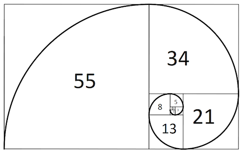
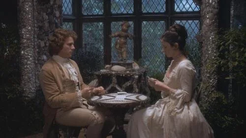
While there is a whole history of art, nature, architecture and design surrounding this golden ratio, notice — for our sake — how this looks within a nine zone grid? Correct. The spiral starts at an intersecting point; the start of the spiral can be pivoted to any of the points. The golden ratio can be used to create different compositions with varying purposes, such as having focal points surrounded by empty space, or to help tidy up a busy shot. Here’s a still image example from Barry Lyndon with the ratio applied.
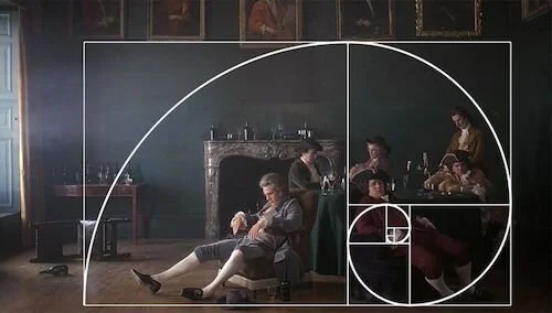
Looks like a painting, right? The film was shot to mimic artwork, so that’s only natural. The golden ratio has been used since the Renaissance era in paintings, so you will find artwork that feels the same way as the above still. Here, all of the people are cluttered on one side, with the subject (Barry Lyndon himself) seemingly in the centre of the shot. With the rule of thirds, this would be an infraction. Within the golden ratio, Lyndon being where he is stands, because the aesthetic focal point is the collection of people on the right. However, this allows your eye to start either at the collection of people and coil outwards to Lyndon and the empty space, or to start at Lyndon and his domestic void and continue onwards to the cluster of people.
Here’s the ratio being used in practice. I’ve avoided using the actual clip from The Godfather Part II to prevent spoilers found within the scene.

In the scene, Michael (Al Pacino) is the focal point on the right. Notice how the family members (and Abe Vigoda in the back) are smushed together, but they create some sort of ease. Now, fast forward to the rest of the scene.
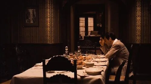
Michael is completely alone, and that once-busy space is now empty enough to be noticeable. I’d argue that the first image has the spiral starting on the left bottom intersection, and it pans over to the right (where Michael is sitting) in the second shot. You can also say that the spiral always started at Michael, but I can see both being possible in this iconic sequence. This happens in one unbroken shot, so the composition and choreography here to achieve this is outstanding. As you can see, the rule of thirds is still being utilized to some degree, but this is taking the visual aesthetic planning of a film’s photography to a whole different echelon. Now, it’s more than just having one or two focal points be where they need to be. It’s a whole arrangement of a shot. At this point, it’s far from a cinematographer trying to get a good shot, but about the scene being anchored by the shot itself entirely.
How to Use the Centre of the Grid
As the lesson at the start of this article stated, the rule of thirds is just a guideline and not a commandment. You do not have to use this rule at all, never mind use it all the time. However, it does help to consider it at all times if something looks off. Then, there’s the complete opposite end of using this grid, and that’s to completely ignore its intentions entirely. In order to do that, you have to have a good reason why, and the answer is usually symmetry. If you can create an interesting shot that is equal (or equal enough) on both sides, then the image will work, just in a different way. Think of it not as the grid being broken, but just being used differently. There is no better example than the works of Wes Anderson, which are tethered to the visual balance of symmetry at almost all times. So, we leave you with this video montage of a few of his films, and I think it says enough about symmetry in film.
Andreas Babiolakis has a Masters degree in Film and Photography Preservation and Collections management from Ryerson University, as well as a Bachelors degree in Cinema Studies from York University. His favourite times of year are the Criterion Collection flash sales and the annual Toronto International Film Festival.