Distance Learning Film: Camera Angles
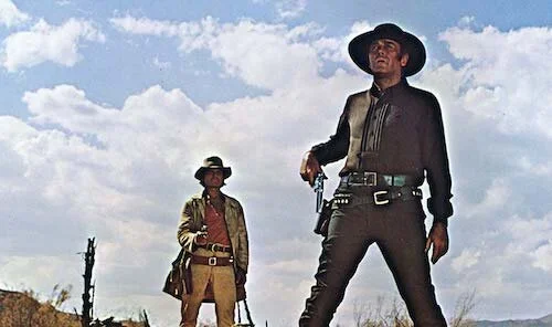
Once Upon a Time in the West
Yesterday’s lesson on certain types of shots found in film, so the bare basics of what a shot can contain was covered. Today, we’re looking at angles, and the importance of how a camera’s position can affect visual storytelling. A series of techniques that have improved over time (thanks to the evolution of cameras, equipment, and other factors), the way a camera is angled can greatly shift the tone of even the simplest of shots. So, you want a medium shot to get a conversation between two subjects in. Great. Is this a friendly chat, or a menacing encounter? Sometimes, the positioning of the camera — and not just in the sense of distance — can create that tone before words are even uttered.
Today, I’m shouting out No Film School, who have an easy reference guide to all types of shots and shot styles that can be used. No Film School is a forum for filmmakers from across the globe, with lessons, news articles, and even gadget recommendations. I have come across this site a number of times during my research, but today’s article felt like the perfect time to promote them. If you are an aspiring filmmaker, this is a great place to get in-the-know about the industry, even if you don’t have any academic experience. When I kept doubting myself whilst writing my lesson today, I jumped back onto No Film School to see how I was doing. It’s reliable, and easy to navigate.
Let’s get started!
Note: Any of the following clips can be considered spoilers for their respective films. Reader discretion is advised.
Eye Level
The Master
Arguably the most basic type of angle is the one found at eye level. If it looks flat, that’s because it is. The idea is that you are meant to feel as though you are on the same wavelength as a character. Maybe someone is talking to the camera, like in the above shot from The Master. It’s a standard type of shot that creates a neutral ground; a tabula rasa so a scene can create its own identity narratively, performance wise or through other avenues (sounds and music, maybe). If you want to just feature a conversation or a subject without preconceived notions, this is one of the main ways you can do so.
The first conversation in Lady Bird is at eye level, so you feel you are a part of the conversation between a teenager trying to find her own identity, and a mother that feels as though she may be losing touch with her child. In the car, the camera bounces around from the perspectives of the mother looking at her daughter, the teenager looking at her mom, and the outsider peering into the car from the front. At all times, you feel as though you are at eye level with them, so anything you get out of the scene is entirely from their squabble, which you aren’t necessarily warned about (or about Lady Bird leaping out of the car at the end of the scene. Spoiler for those who haven’t seen the film: she’s fine). Shooting this scene more tensely may have made the ending much scarier than it is. Instead, it’s played off passively, to comedic effect.
Shoulder Level
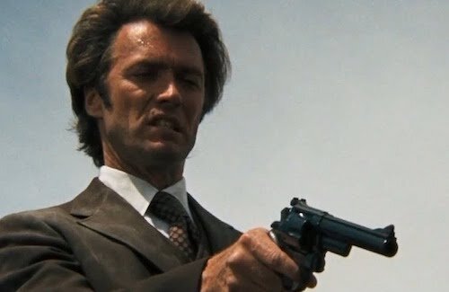
Dirty Harry
Similar to an eye level shot, and arguably the other most convenient type of angle you can get. Imagine someone shooting a scene over their shoulder, so you get a tiny bit of leverage over a shot, and yet people still resemble people (no weird angles or anything). That’s the shoulder level angle. You don’t feel as though people are talking to you, but you still get that sense of the body language and facial dynamics of a person (or people) on a neutral level. From this angle, you’re going to only get the upper portions of a person or people; to achieve a full shot, you’d have to be at quite an angle, or from a considerable distance away.
Once the officers in this Hot Fuzz get chatting with their suspect, you get a good look at a shoulder level shot. You see the three coppers well enough, but you don’t feel a part of this discussion at all. The film is considering you as an audience member only, which is perfectly fine for a buddy cop comedy thriller. The immersion is with how much fun you have, rather than trying to place you in the heat of a conversation on a personal level.
High Angle
La noire de…
We’re going to start soaring up from now, just for the next few entries. A high angled shot is one that clearly peers down on a subject or setting (notice how surroundings and objects are now a part of the equation on an aesthetic level with this kind of shot). Here, a heavy intention is used. In some cases, this can reflect the lack of power a character has, or their intimidated position in that moment. In the above shot from La noire de…, the maid is filmed in a way that she is being looked down upon for her work. She is shot in an unworthy way, within a film where this character faces racist backlash and classist disregard. You can also use high angled shots to show other types of vulnerabilities, including heights, skewed objects, and other aesthetic imagery.
Vertigo begins with a police chase that traumatizes a detective for life. Mixing overhead shots (the next segment here) with high angled images, you get a true sense of how high up this character is, and why he may be so scared of what lies below him. He’s not only hanging from a great height: he’s clearly shaken up, and powerless here.
Warning: the following clip features a possibly triggering sequence. Reader discretion is advised.
Overhead
Dogville
The sharpest angle downward you can get is the overhead shot, also known as a bird-eye-view shot. This is great for the depiction of a setting in a map-like format, or to showcase a character’s size and state compared to their immediate surroundings. This is literally a shot facing down on characters and/or setting. Honestly, this type of shot creates an otherworldly feeling, so it can sometimes be savoured for films that can benefit from this type of an odd perspective on the world, mainly because it’s not a view we would likely get in our day-to-day lives. Extreme wide shots and wide shots can benefit from this angle depending on what the film calls for.
At the end of this scene from Eternal Sunshine of the Spotless Mind, the two lovers are shot from above, and their position on the ice makes them seem as though they are floating in space. There is nothing but soothing emptiness around them, as they gaze at stars. From this angle, we have no idea what the stars they’re looking at resemble outside of what they tell us. We just see two people who were once in love, enjoying each other’s company. We get that out-of-body experience, fully selling the idea that this is a memory or a frozen moment in time when everything was great within a relationship.
Aerial
The Lord of the Rings: The Fellowship of the Ring
The most drastic high angle shot you can get is the aerial shot, usually by using a crane or — nowadays — a drone. This places the camera extremely high up, and with the ability to cover great distances from a single glance. Extreme wide shots are the kinds of images you’ll get from this angle. These are great for depicting landscapes and other types of settings, as well as creating a sense of the scope of a character’s surroundings. You know this is a rough mission in the above image from The Fellowship of the Ring, because you can see the endlessness of the trek of the titular fellowship.
In this beautiful sequence from Lawrence of Arabia, you’ll see an army take on Aqaba. You will be placed inside the city and within the stampeding swarm of soldiers, but the greatest moment comes from the far away aerial shot that gives you a specific idea of just how many warriors are taking part in this conquering of Aqaba. It’s the type of realization that only an aerial shot can give you, when all you can see is a city and a barrage of fighters crashing right into it.
Low Angle
Blow Out
Now that we have finished being high up, we’re going to start to go low. If high angled shots made characters feel inferior, then low angled shots have the opposite effect. Shot from below and facing upward, low angled shots create intimidation and superiority in a character. Usually if a character is meant to be taken seriously, they can be shot from below to give them an overbearing, powerful stance, as if they tower above you. This also causes settings and objects to loom, as if they are difficult to withstand as well. To create cinematic dominance as easily as possible, go for a low angle shot.
Dr. Strangelove is a satirical comedy, but notice how menacing the general in the below clip is just by the way he is shot. When we initially enter the scene, we think nothing of him. Once we get that first glimpse of the general from below, we know he is shady in some sort of a way. Then, he flashes his gun. We were right. Notice how the general is sitting, the captain he is talking to is standing, and yet he still manages to loom over him simply because of how he is shot. He doesn’t even need to stand when the way he is captured does enough of the legwork for his character’s perceived essence.
Hip Level
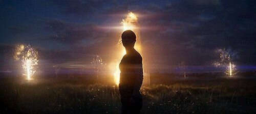
Annihilation
Almost like a hip version of the shoulder level shot, this type of angle is maybe not quite as neutral as the latter mentioned example. At hip level, you’re bound to be looking upward to some very slight degree. In the Annihilation shot above, you get only the faintest sense of dominance from the captured character, as the world around her crumbles. She isn’t in complete control, but she is still of some sort of prominence in this image. You can utilize shots at this angle in a variety of ways, even outside of a sliver of power. You can create a pinch of discomfort, awkwardness, or any other form of oddity, since people, places and objects feel like they’re tangible, yet they’re somewhat off (and not in the same over-the-shoulder way that a shoulder level shot would).
In this comedic relief moment from Children of Men, two characters are taking hallucinogenic substances and having a casual conversation. Even though these characters are shitting, we still can see the underside of their noses and a bit of the shadows that a low angle shot would give. We’re not looking down at them as they sit. We’re arguably slightly lower than they are, which expands the room up, and gives the two chatterboxes a slightly larger stance (but not too large to be frightening). So, we feel a bit unusual but still normal, as if we are a part of this high.
Knee Level
Dirty Dancing
I personally find the knee angle shot to be quite limiting, because it places the camera at such an obnoxious angle or level. You’re either getting the legs of a person or animal, wheels of a vehicle, or some sort of other low level variant, or you’re viewing subjects from such a skewed angle. What does help here is getting the scope of the floor in a shot, which can smush a room in comparison. This type of shot is useful for furthering the weirdness and abnormality of a hip level shot, or for allowing the floor to take up more of a shot (rather than being high up and looking down, you’re shooting low and allowing the floor to go past the middle point upwards). Either that, or you’re showing legs or the like for running, or to show speed; maybe to create a rush in a chase sequence or a scene of a similar nature.
The last moment in this The Grand Budapest Hotel moment has the policemen looking slightly intimidating (more for the concierge that flees the scene), and the entire lobby now looks off enough that you know something is wrong; Wes Anderson’s iconic flat symmetrical look has been substituted for this off-balance image. Plus, you get a sense of the lobby’s floor and the height of the foyer, and can see the concierge sprint off goofily with incompetent cops after him. It’s somewhat threatening, and completely goofy.
Ground Level
Pulp Fiction
This type of shot isn’t used too often, but occasionally, getting close to the floor can set up a plot device of some sort. In this Pulp Fiction shot, we know that this mob wife is carefree (shoeless) and animated (her stance) before we even see her face (outside of her lips talking into a microphone earlier). In other cases, you might be seeing how characters stand, given their comfort in their own shoes (or lack of comfort). You may get a surreal look at the setting from a bug’s level, if need be. Since this is a limiting shot, and you’ll rarely get a character’s essence outside of their legs and feet in a shot (unless you look upwards at a very drastic angle, which turns into a low angle shot at this point), you won’t be able to capture too much by doing this. However, there is clearly a call for a ground level shot at times: to establish bodily comfort within a stance, or to capture what’s literally happening on the ground.
This leads us to the opening of Blue Velvet. We get a ground shot of a fence, pulled upwards to create a low angle shot; the growing roses have a godly feel to them now. Fast forward to later on in this opening, after a man has his heart attack. His body is flush with the ground, and the film instils this oneness with the earth during a crisis in an abstract way: by zooming into the grass from ground level. Being able to be a part of the insects that hide underneath the blades, you begin to sink physically into the earth on a literal level, and you become delirious mentally by departing from what we know as humans on a daily basis. Then again, this opener carries extreme examples of ground level shots, so there you go.
Dutch
Slumdog Millionaire
Now that we’ve gone both as high and low as we can (we can’t do any better than the sky and the ground), we have one last angle to cover, and it may be the most obvious: the Dutch angle. Also known as a canted angle or a dutch tilt, this hyper stylized angle is on a noticeable slant. This is reserved for specific situations, say to create an extreme discomfort in a scene or uncertainty. This is great for creating delirium as well. An entire setting becomes an obstacle course, and a character seems to fumble through it rather than exist normally. Either that, or a Dutch angle can accent a scene to cause tension. Either way, do not use a Dutch angle if you want a scene to play off normally. It’s as abnormal as you can make a scene before you start angling it (then again, high and low angled shots can be canted as well).
In this climactic moment in The Third Man, the protagonist is starting to question his own reality, when the city he patrols begins to turn on him the most. What was once a stomping ground is now a maze, and nothing makes any sense. You get the panic of the situation simply by how each and every shot is captured on a slant alone, even if any form of music or dynamic editing was erased.
Note: Contains a major spoiler for The Third Man. Reader discretion is advised.
To end this lesson on a fun note, we now feature a terrible example of using Dutch angles. I like to bring up how films would be terrible if they were made up entirely of one shot. Well, Battlefield Earth is mostly made up of Dutch angles, and it’s beyond nauseating. Nothing here separates the intense moment from the previous jovial parts found in the same sequence. Everything is on a slant, and nothing feels normal (and not in a good way). This is intolerable to watch in an entire film, but this scene will suffice alone. This is a lesson in creating shot variation to allow scenes to breathe. Don’t get me wrong. One thousand other things are terrible about this scene, but we’re focusing on how poorly it is shot right now, which may be its most noticeable offence right away.
Andreas Babiolakis has a Masters degree in Film and Photography Preservation and Collections management from Ryerson University, as well as a Bachelors degree in Cinema Studies from York University. His favourite times of year are the Criterion Collection flash sales and the annual Toronto International Film Festival.


