The Bare Basics of Editing
Editing is one of the major filmmaking aspects that can be heavily taken for granted. Today, I hope to place an intense focus on the cinematic fundamental that is an art form in and of itself. Good editing can be something you don’t even notice, because the fluidity of the series of images on screen is shifted into a pleasant pace that matches the narrative. Bad editing will stick out, even if you can’t explain why. You’ll likely feel a headache, or taken away from the film you’re trying to enjoy. I’ll do more detailed lessons on editing in the future, but today’s class is meant to just be an observation as to why editing in film isn’t just important: it’s downright crucial.
Editing assembles images and sounds together in a way that makes sense. Usually, this is in chronological order, but some films and/or editors will break this linearity for particular reasons (to create a twisting plot, contain flashbacks to previous scenes, and more). What viewers that are new to the ways of editing must understand is that the majority of films they watch aren’t shot literally as you see them. If this is true for special effects (placed in through CGI) or songs and sound effects (sound mixing and editing), then it must be true for editing as well. Say a film features multiple scenes that take place within a specific diner. I’d guarantee that every diner scene was shot in the same time period, with costumes being swapped (and other factors necessary being changed), as to cut down on budgetary costs and fulfil multiple necessary shoots at once. You won’t find these diner scenes together in the film; they will clearly be spread apart.
Apply this ideology to many scenarios. The same line of dialogue is shot multiple times, and the editor pieces together footage to make a dynamic interpretation of this moment, given what they have to work with. Something that was shot doesn’t really work out and it’s too late to reshoot the scene; an editor can try to cut around this to save the day (or cut the moment entirely if it just doesn’t work and isn’t vital). An editor isn’t just slapping together the literal footage you see on screen. They’re working with hours and hours of footage, oftentimes of the exact same lines of dialogue and/or establishing shots from different angles. This is the conversion from raw footage into cohesive story. A great rule of thumb I was taught in my undergrad is that a film’s story gets told three times: the way it is written, the way it is shot, and the way it is edited. The edited product is the final time this story is told, and many major changes to the tone of a story can take place between these three stages. How closely does the final cut match what was written or shot? How different is this result?
A good place to start is with a silent film, considering the difficulty of editing back then and the limitations of recording technology. Look at this scene from Modern Times, and almost every single image you see is given a very specific purpose. There’s not really much room for creative experimentation, here.
Every single shot means something. Every pause on a scene is for a reason. You see the Tramp (as a factory worker) get stuck in a feeding machine that malfunctions. Shots linger on him so we can see and laugh at the misfortunes. The scene cuts to employees and an executive potentially hoping to purchase or distribute this invention. We get to laugh, as we watch the machine break down and the Tramp react. We see how employees try to fix the machine. We see the reaction of everyone involved. The scene puts more time into seeing the Tramp suffer, for sadistic comedic benefit, and most other cuts are quick, to progress the scene and give us a clue as to what is going on outside of this madness.
Again, editing is taken for granted now. One must remember that everything you see (and I do mean everything) is for a very specific reason. You might think that’s strictly a photographical element, but that’s just what we see. How these images relate to one another is entirely editing. Here’s a well known clip by Alfred Hitchcock on the importance of knowing what images to place where, and how editing can change not just a scene but characters entirely.
As you can see, editing is much more than piecing moments together. It’s about understanding why these moments work together, and how these juxtapositions can benefit one another. This accentuates the uses of camera shots, which can be read about here. You set up shots for specific meanings (represent a character, show an emotion, introduce a setting, et cetera), but it’s the partnership between images caused by editing which gives even more purpose to these images.
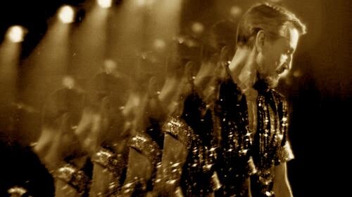
For an example of how editing can disrupt this language, here’s a breakdown of a scene in Bohemian Rhapsody by Thomas Flight: a fantastic online educator that details the intricacies of editing.
If you’re unfamiliar with editing, maybe the above scene wouldn’t bother you at all. Maybe it did, but you couldn’t figure out why. This seems like an example of cutting for the sake of cutting (perhaps to match the upbeat editing style in the musical scenes). Either that, or the footage at hand wasn’t good enough and this was an editor trying to make the best with what they had. That latter possibility is more difficult to believe, given the amount of extra shots that crowd the pacing.
To contrast this, here is a lesson in good editing, presented by Fandor. Requiem for a Dream is constantly praised for its editing, particularly because of its fast style which still works. There are easily as many (if not more) cuts here, if we’re comparing this film to Bohemian Rhapsody, and yet what we see is much more understandable. This is because of the images being featured, the reasons they’re featured, and the balance of pacing; the above Bohemian Rhapsody scene was during a sit down discussion, and Requiem for a Dream wouldn’t be frantically paced in a normal sit down discussion, for instance.
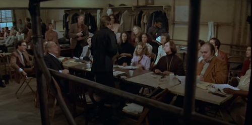
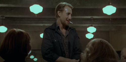
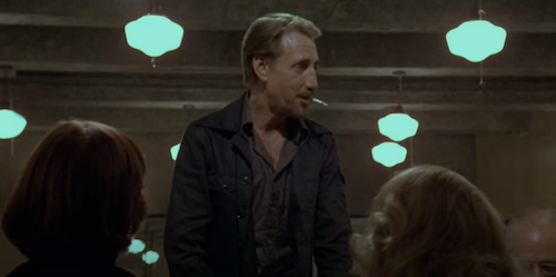
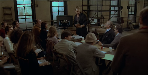
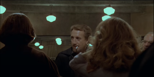
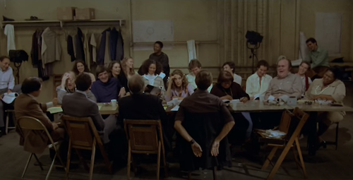
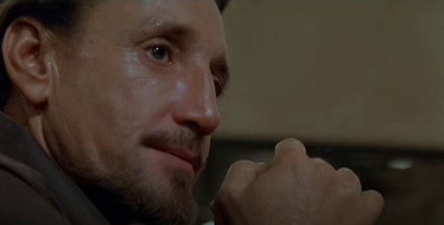
For an extensive look at the editing in a scene that showcases great uses of proper techniques, here’s a scene from Bob Fosse’s musical drama All That Jazz, edited impeccibly by Alan Heim. The purpose of the scene is to show a theatrical director performing a table read with the cast and crew of an upcoming production. It goes horribly wrong in the director’s mind, but appears rather normal in reality. Here’s the scene as is, before I break down (nearly) every shot and the importance of what we see.
So, what makes this scene work so well? Why is Heim’s work in All That Jazz considered iconic editing? Let’s break down this scene shot by shot (with a bit of a skip in the middle, otherwise we will be here all day).
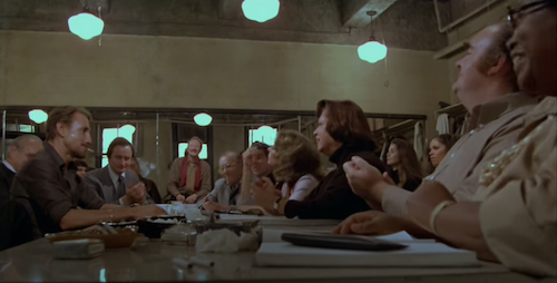
We’re introduced to the scene: a wide shot of the room, with a focus on the cast and crew as opposed to the lead director (Joe Gideon), who we are all familiar with at this point in the film.
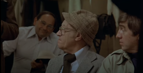
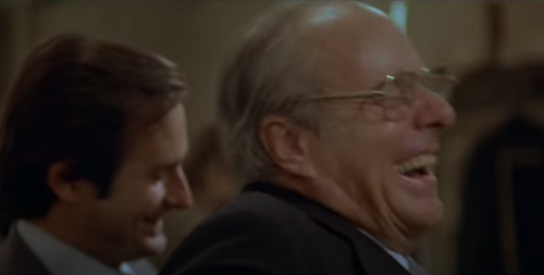
Cut to a quick close up of some of the other people in the room, so we get a sense of how they’re receiving these instructions by Gideon.
Back to Gideon, so we don’t lose sight of how he is trying to command the room.
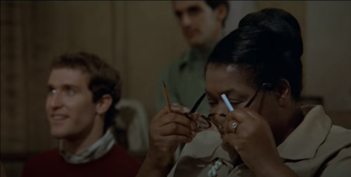
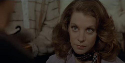
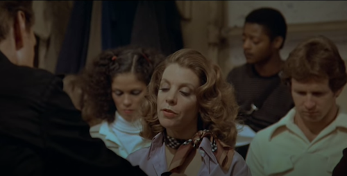
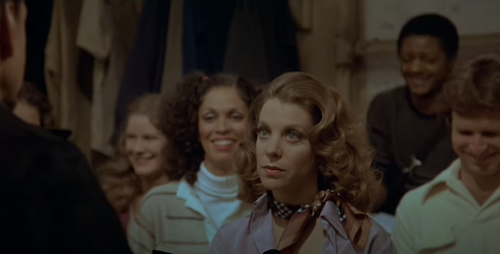
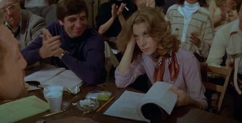
Now we see his ex-wife Audrey Paris, who has a different look to her face. She knows this person outside of him being a director. We know this, but the scene needs to remember this as well. A quick cut to this expression is great; it also showcases a good performance by Leland Palmer, whose perfect reading of her cues would go to waste without her inclusion here (especially because of her character’s importance to the scene).
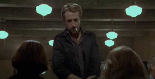
Back to Gideon, who now has his ex-wife’s refusal to sugarcoat situations in the back of his head.
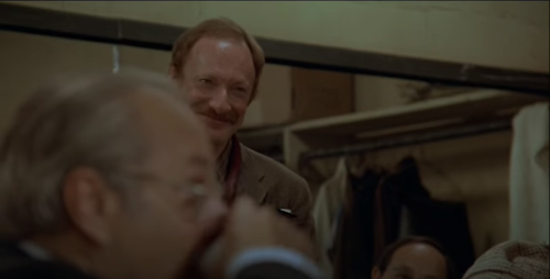
Here’s a contrastive shot: another person who is willing to put on a fake smile to appeal to the director. This is very different than the shot of sincerity with Paris.
Back to Gideon. This time, he is directing the attention of the cast and crew here towards a particular person.
Cue a shot of the people looking towards said person, which establishes a reaction and a spacial relation. Also, we’re reminded that these people are intensively listening to Gideon’s every word, as they do as he says.
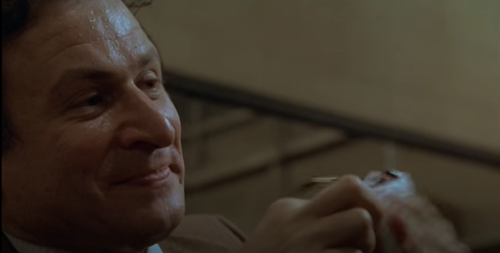
Here’s the man Gideon was referring to. Now, we have a face to a description.
A wide shot from just behind this gentleman, further establishing the space of the scene, this time from a different angle. We see where Gideon — and everyone else — is in relation to this position, which was once a focal point mere seconds ago, and is now a vantage point.
To ease us back into a state of temporary comfort, we’re repositioned back to a familiar shot: the front facing image of Gideon. The table reading begins.
A shot of Paris reading one line from the screenplay is lingered on, so we can listen closely as well. Then, the freakout of laughter begins.
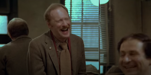
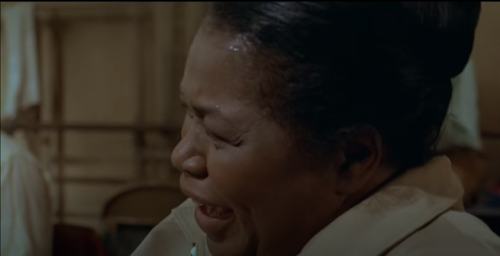
The film now cuts to images of people we have seen before, pairing these shots together: the intensive listening before, and the fake laughter afterwards.
It happens again,
and again multiple times (even after these initial cuts).
We cut back to the home base shot of Gideon. He clearly looks unamused. He knows this screenplay is garbage, and the response is ficticious.
Cut to Paris. She clearly knows this too. And yet, people around her cannot stop laughing.
The middle portion of this scene continues the laughter shots, but also focuses on extreme close ups of what Gideon is fixating on, as he zones out of the table read. The sound cuts out, and we can only hear Gideon’s various forms of fidgeting: finger tapping, cigarette stomping, and more.
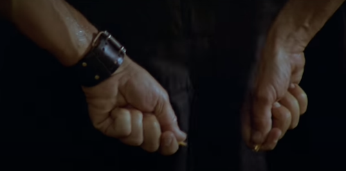
Let’s cut forwards ourselves. This whole middle section is full of the same ideas, but the same goal: place us in Gideon’s mental nightmare. We’re now at the part where Gideon breaks the pencil.
As his insecurities take a strong enough hold that he “breaks” (literally and figuratively), we’re then placed in a wide shot afterwards, as the sound cuts back into the scene.
Was this a release? Was this the end?
No. The scene keeps going. I highlighted this moment, because comparing this shot to the previous shot looks like an error in continuity. Gideon’s hands were just behind his back, as he dropped the pieces of the snapped pencil. Why are they now immediately in front of him? Isn’t this bad editing?
Not quite. It feels disjointed on purpose. As you can see with the next image…
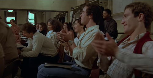
there is an applause. We can’t know for sure, but this could be the end of the read. Books close involuntarily as hands are raised to clap.
This is our confirmation. Paris stares at Gideon with a face of dissatisfaction, as she hesitates to close the screenplay for a few seconds, as if to punctuate the torturous event that reading his screenplay was. The disjointed cut before wasn’t a mistake. It was a leap forwards to the end of this nightmare, to save us all from this process.
The final cut is a pause on a wide shot, as Gideon feigns appreciation. We get a breath of fresh air after an unpleasant episode, and can soak in the response of everyone else. Gideon is being just as fake with his cast and crew as they are with him. We get an example of this lack of honesty, and how it causes zero disruptions or forms of discomfort in the overall atmosphere of the scene.
Understanding editing that tries to break conventional practices may be difficult at first, but knowing what we know now, hopefully the difference between risky editing and bad editing is more apparent than ever. Take this scene from Breathless.
A conversation is broken up by jarring cuts. This still works, because we are always aware of our focal points (mainly Jean Seberg’s character). The film leaps forwards in time even mid sentence, but we never lose track of who is talking, where we are (in the vehicle), and the spacial relationship between these characters. What we do get is an experimental take on the passage of time, as if this conversation transcends the typical conventions of time. This creates a montage-like sensation, despite no montage actually taking place, and a clear indication that these characters have been driving around for a very long time. This is unconventional editing that works.
Let’s end off on the other end of the spectrum, with what is arguably one of the worst edited scenes I perhaps have ever seen in a major motion picture. Just… watch away.
Uncomfortable attempts at romantic appeal are in the following scene. Reader discretion is advised.
What I can tell you is that this is likely the result of having no material to work with. The scene calls for Halle Berry’s character to accidentally show off her superpower capabilities (mainly acrobatic tricks, strength, and leaping great heights), and the editor clearly had zero footage that convincingly represented any of this. So, they had to slap together any and every image that could work in making this illusion. Instead, two things happen. Firstly, we get a major headache-inducing mess of a sequence. Secondly, the importance of establishing shots is completely abandoned. Out of the plethora of cuts here, what did we learn with the majority of them? Maybe what the reaction of the kids were, where the net was occasionally, the continuous reminders that these characters were playing basketball the exact same way every single cut, and that these characters are being unnecessarily thirsty in front of children.
In future lessons, I will go into various tricks and styles of editing, but I hope this brief overview showcased the fundamentals of one of cinema’s most essential practices.
Andreas Babiolakis has a Masters degree in Film and Photography Preservation and Collections Management from Ryerson University, as well as a Bachelors degree in Cinema Studies from York University. His favourite times of year are the Criterion Collection flash sales and the annual Toronto International Film Festival.
